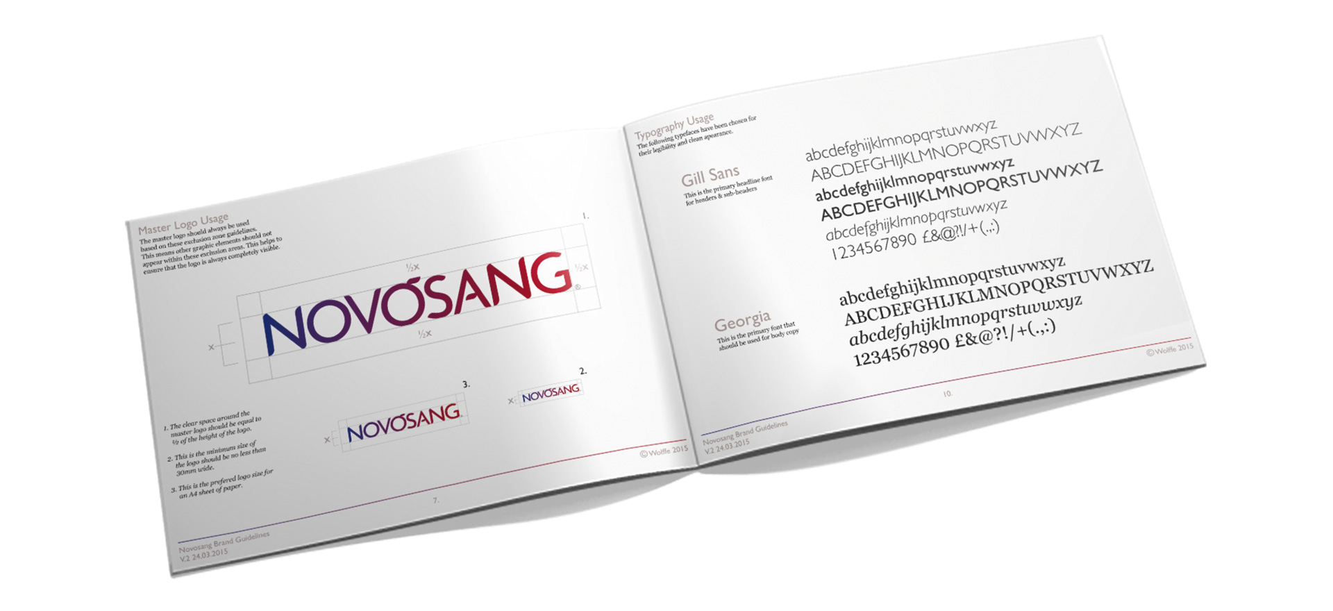
NOVOSANG
Naming & Brand IdentityWhen some of the UK's top universities, funding bodies and research institutions got their heads together with all the blood transfusion services in the UK and Ireland, ideas started to flow. But there was a concern that this multi agency approach could implode if it didn't have a name or badge to get behind.
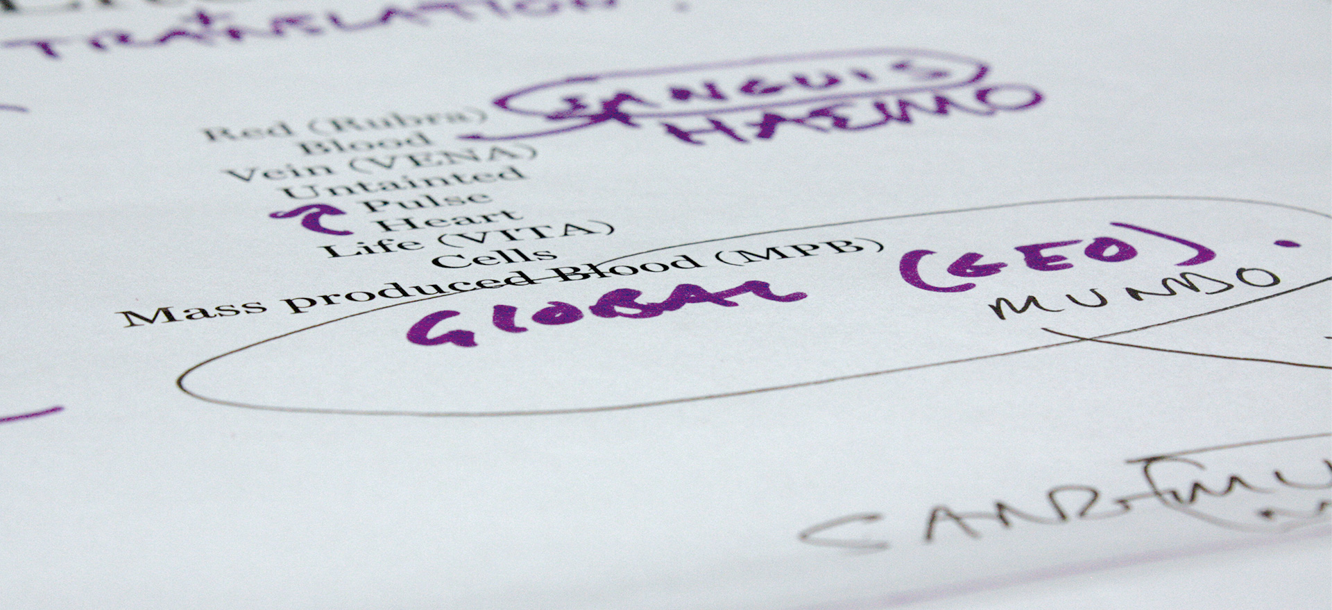
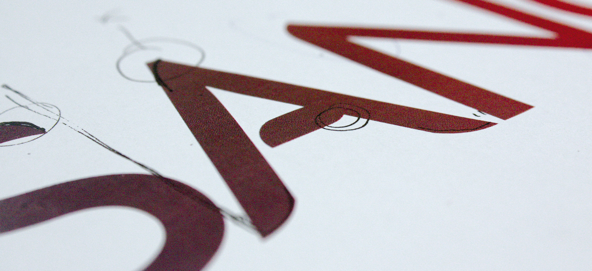
That's where Wolffe came in; our workshop approach to naming and branding an organisation was adapted to deliver a new name and logo for everyone to rally behind.


