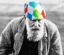
We were appointed to rebrand and reposition Laing and apply the same thinking to their Parkhouse brand.
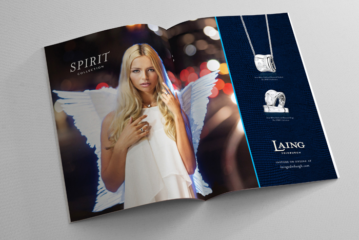
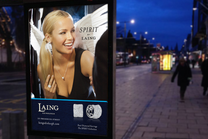
As a traditional family jeweller with all the brand cues of trust, reliability and quality, we wanted to add an element of cheeky, sexy and quirky.
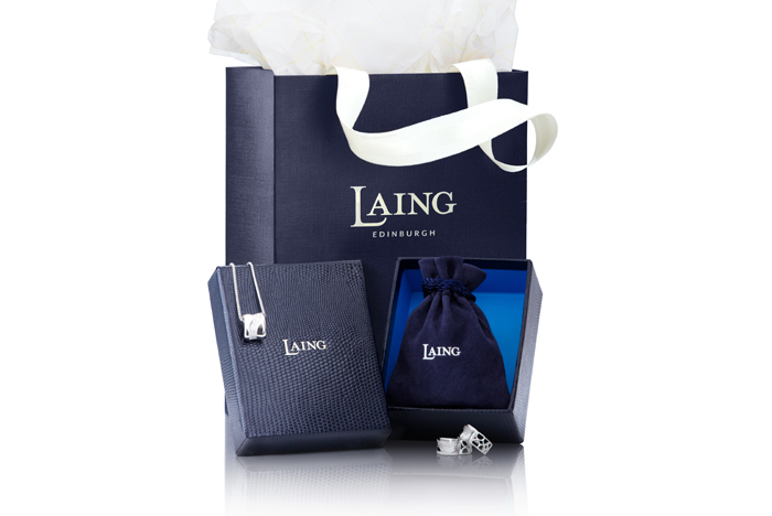
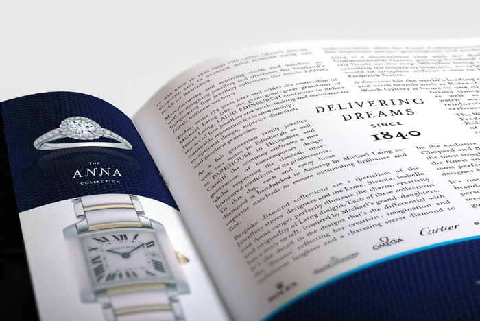
The re-drawn logotype, lizard skin backgrounds and fashion inspired advertising photography has repositioned the business as a more confident premium brand.
Laing Repositioning
- Categories →
- brand
- communication
- identity
- packaging
Portfolio
-

Laing Repositioning

-

The Saltire Society
-

Spinouts
-

Solamante
-

Bruichladdich #laddify
-
Scottish Legal Awards 2013
-
World Whisky Day™
-
Speirs & Jeffrey
-
The Balmoral Hotel
-

Tennis Scotland
-
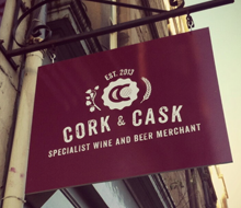
Cork & Cask
-
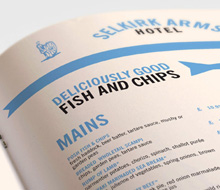
Selkirk Arms Hotel
-

Red Sky Management
-
Tales of Turnberry Campaign
-
Nobu London
-
Bill McLaren Foundation
-
LVMH for Glenmorangie
-
Edward Sahakian Cigar Bar
-
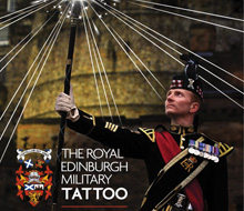
Royal Edinburgh Military Tattoo
-
Royal & Awesome
-

Glyde